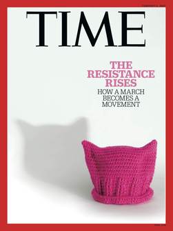
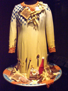
Unravel: The power and politics of textile art explores the work of artists using textiles to resist, to witness, and to protest. It asks, ‘How can textiles unpack, question, unspool, unravel and therefore reimagine the world around us?’
Two works in the Barbican’s exhibition are particularly powerful expressions of the assertion of state power. Hannah Ryggen’s Blood in the Grass tapestry from 1966 depicts US President Lyndon Johnson overseeing his administration's intervention in Vietnam. Johnson is a threatening magenta presence in a cowboy hat; the fields of Vietnam are tufts of lush green in stripes alternating with vivid, violent red.
Two works in the Barbican’s exhibition are particularly powerful expressions of the assertion of state power. Hannah Ryggen’s Blood in the Grass tapestry from 1966 depicts US President Lyndon Johnson overseeing his administration's intervention in Vietnam. Johnson is a threatening magenta presence in a cowboy hat; the fields of Vietnam are tufts of lush green in stripes alternating with vivid, violent red.
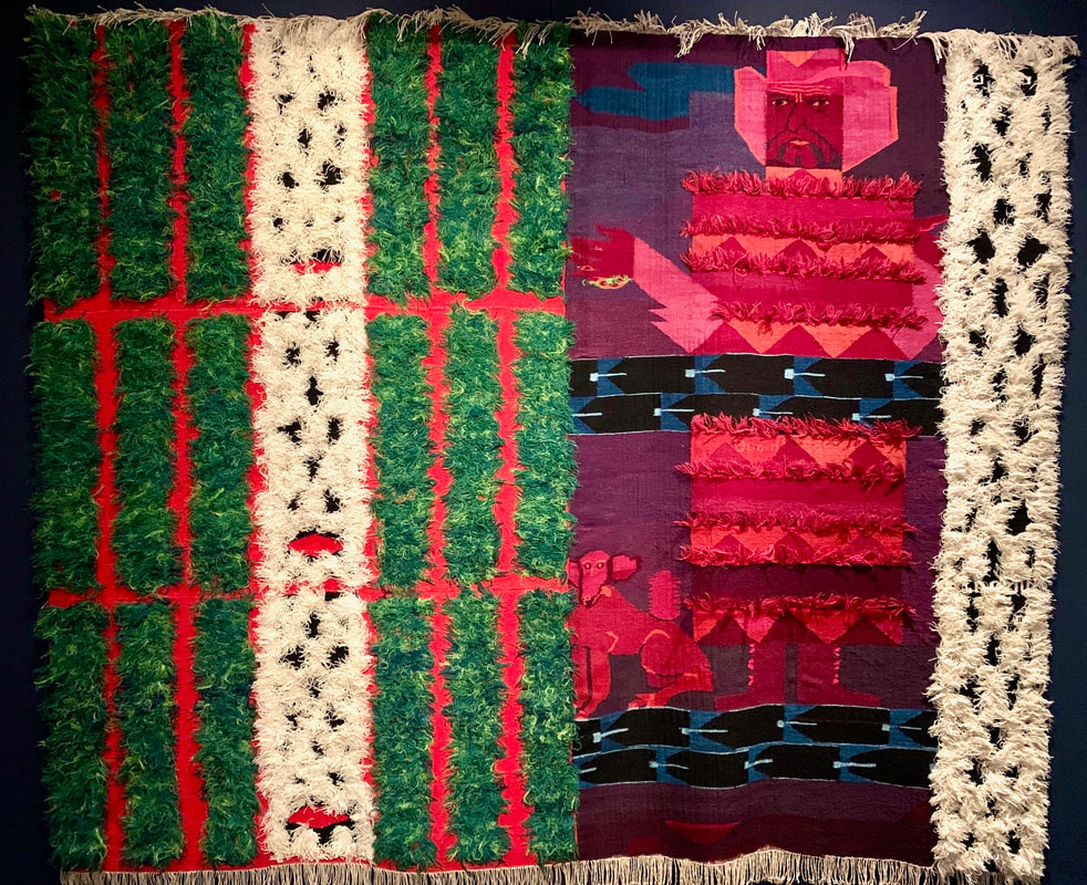
Ryggen was a committed pacifist and feminist whose textile art protested fascist and totalitarian regimes and leaders. Skye Sherwin writes of her work: ‘With their coarse weaves and tufted wool, her tapestries have a terrific, material presence. A committed communist, Ryggen used the weft and warp of the tapestry itself as a metaphor for the knotty social bonds that hold us together.’ Her Blood in the Grass is a hellish vision of state power; her Johnson is monstrous but also human and is accompanied by his pet beagle.
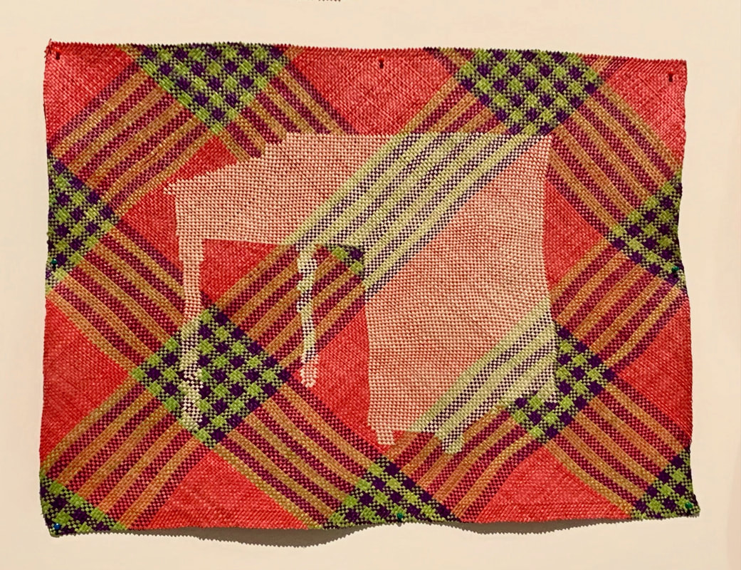
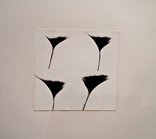
Yee I-Lann’s Tikar/Meja (2018) is a series of colourful woven mats featuring images of tables. Tikar are mats largely made by women and used traditionally in the Southeast Asian Archipelago for sitting and communal gathering. I-Lann explains that in pre-colonial times, there were no tables in this part of the world, and the words used for ‘table’ – meja in Malay and mesa in Tagalog – are derived from Portuguese and Spanish; yet in this region, all languages have a name for ‘mat’. The tables in her woven mats, I-Lann says, represent this colonial power that introduced tables as an assertion of power and dominance. They also represent patriarchy; for her, tikar are essentially feminist and egalitarian, a platform without hierarchy, a form of sharing that is democratic and mutual.
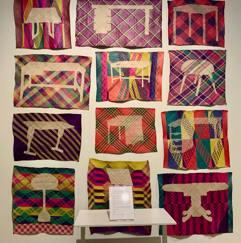
She explores what she describes as ‘the violence of administration’: ‘That violence of administration is more lethal, more violent, than a gun. With a gun I may just shoot you, but with a table, with administration, I will tell you who you are, what your history is, what is valuable to be kept in a museum and what is not, what language you should use, what languages you should learn, what is of value.’
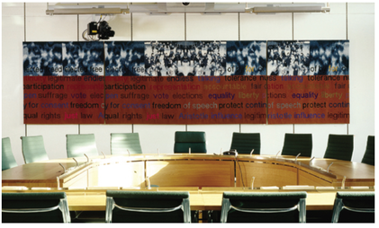
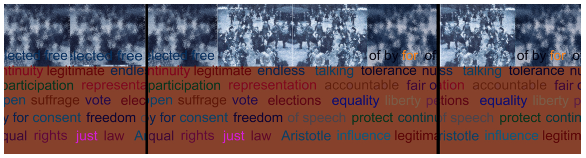
There is a sense that, even when not associated with violence of colonial power, tables and desks are markers of the authority of the state. They are barriers, and they often connote hierarchical status. They dominate the spaces in which we as individuals come across the power of the state – the teacher’s desk at the front of a classroom of neatly ordered pupils’ desks, the table with the glass barrier in the benefits office, the raised podium of the judge in court. They put us in our place.
There is a sense that, even when not associated with violence of colonial power, tables and desks are markers of the authority of the state. They are barriers, and they often connote hierarchical status. They dominate the spaces in which we as individuals come across the power of the state – the teacher’s desk at the front of a classroom of neatly ordered pupils’ desks, the table with the glass barrier in the benefits office, the raised podium of the judge in court. They put us in our place.
The exhibition has been beset by its own political controversy. Several artists chose to withdraw their work after the Barbican Centre declined to host the London Review of Books’ Winter Lecture series because of discomfort expressed about the topic of one lecture – Pankaj Mishra’s ‘The Shoah after Gaza’. (The Barbican refers to its disappointment that it was ‘not able to get the necessary logistical arrangements in place to host the LRB Winter Series.’)
I-Lann took an unusual stance – she chose to include Tikar/Meja in the exhibition, but she made a statement and requested that the Barbican display this on a table in front of her work. In that statement, she says that she was ‘deeply troubled’ by the accusations directed at the Barbican. To withdraw or to participate suggested to her a binary choice that is the antithesis of what her work is about. Tikar/Meja is a work that recognises not just the violence of administration but the other forces at play, including censorship. I-Lann writes: ‘At the table, through tables, through administration, through education systems, officiated histories – through institutions. The actions performed at these metaphoric and literal tables enter the mind and become inherited…. The mat draws from other power systems and calls for people to share a platform together.’
Unravel: The power and politics of textile art is at the Barbican Centre in London until 26 May 2024.

 RSS Feed
