Good at Looking
  • Good at Looking blog
  • About Good at Looking
  • Contact Good at Looking

Lost & found at the V&A…

7/8/2018

1 Comment

 
…a series inspired by my experiences as a volunteer Welcoming Ambassador at the Victoria & Albert Museum

The importance of thresholds and seams

'In the universe, there are things that are known, and things that are unknown,
and in between them, there are doors.'

William Blake
Picture
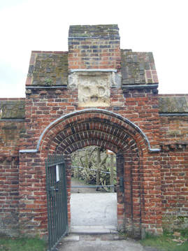
'Threshold' is a bridge from light to dark, from the known to the unknown, and it holds the potential for both fascination and terror. Mae Architects describe it as 'transition space', as 'enfilade' of space, which leaves areas of doubt between spaces and their use, such as between inhabitation and 'transition'. In their book of essays, Places for Strangers (2014), they give examples, such as the quadrangles and courts of Oxford and Cambridge colleges, of enfilades offering 'space to dwell, to move, to encounter'.
 
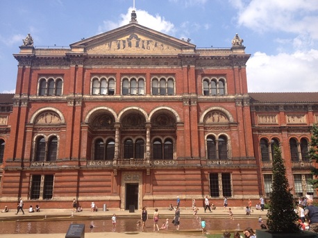
The V&A's threshold space
 
The opening of the V&A's new Exhibition Road entrance in June 2017 changed the relationship between the museum and the spaces and places on Exhibition Road, including the National History Museum and the Science Museum. The design, by Amanda Levete Architects, also links in (almost) seamlessly with the Shared Space design of the road; a Dutch innovation, Shared Space is a counterintuitive approach to road safety that involves removing the usual barriers, signs and traffic lights that separate pedestrians from cars. Recently, V&A Director Tristram Hunt suggested that the new entrance had helped the museum attract a 26% increase in visitors and that one factor is that the new entrance is less intimidating than the grand 'castle keep' way in on Cromwell Road. “All the data we have shows that it is much more attractive to non-traditional museumgoers,” said Hunt. “It is less, frankly, scary.” (The Guardian, 18 July 2018).
 
The new entrance also created a 'transition zone' as recognition that entering the museum (any museum) can be intimidating for some visitors. On the V&A's blog, Kati Price explains:
 
'The new Sackler Courtyard offers a ‘decompression zone’ – a threshold space between the busy Exhibition Road and the Museum itself. Like plazas, parks and entrance courtyards to other museums, this threshold space allows people to enjoy the beautiful surroundings without having to commit to entering the building. These are important transitionary spaces, helping to ease people into the Museum which – for some – can be intimidating.'
 
My experience as a Welcoming Ambassador at the V&A is that people using the new courtyard are often confused as to whether or not they are in the museum – indeed some aren't even aware it is a museum. It intrigues while at the same time giving the impression of being open to all – even if they don't always know what 'it' is.
 
Yet the effect achieved may not be what was intended, and partly that's down to the unpredictability of people. Price describes the ambitions for a 'digital welcome' to the museum, using apps and other digital technologies to help visitors explore the museum and its collections and heritage. But she notes that so much changed from 2012, when that ambition was originally set out, in terms of technology but also in the understanding of people's behaviour. What she and colleagues discovered is that instead of focusing on the 'digital welcome', they needed to take a step back and consider what people wanted, realising that 'to separate out the digital from other elements of the welcome experience risks a fragmented visitor experience that doesn’t intuitively blend the digital and the physical'. They attempted to map the 'visitor experience' – the physical, as in spaces in the museum, and the emotional, the visitor's responses to what she saw. This gave them fresh insights into the way the museum was using digital technology and 'touchpoints', not always to best effect. And it emphasised that real people – the staff and volunteers 'on the shop floor' – were a necessary ingredient.
 
This stepping back also taught the V&A that digital offerings (apps, maps and information) are ever only part of the story – people still want stuff on paper, and they want the right information at the right time. Price summarises the key learning points as:
  • Recognise our people as a vital part of the experience
  • Make our touchpoints more visible
  • Define a clear purpose for each touchpoint
  • Make a more consistent experience
  • Provide the right information at the right time
 
These may seem like obvious, 'Mom and apple pie' type revelations – who wouldn't argue for more consistency and recognising people as vital ingredients? – but they are in fact a reflection of how far the vision shifted from the original 'digital by default' vision set out in the V&A's Heritage Lottery Fund application. (I'm struck by the parallels with the justice system. I'm currently working with a colleague on a book project on administrative justice and human rights, and how the two can be re-imagined with the help of the world of design. There is much in what the V&A learned that is relevant for digitalisation of the justice system, which, like any major museum with historic but confusing architecture, can be daunting to first-time visitors. But one key difference is that the V&A's strategy is to get more people into the museum. The HMCTS's strategy may well be to keep people out of its system, to make the workload more manageable and to keep costs down. That at least is a widely shared sceptical view of the intentions of the current justice reform programme.)

People and their places – connectivity and threshold
Picture
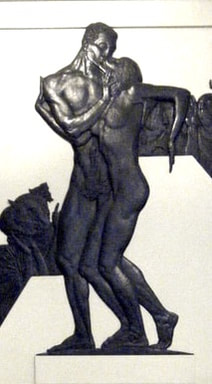
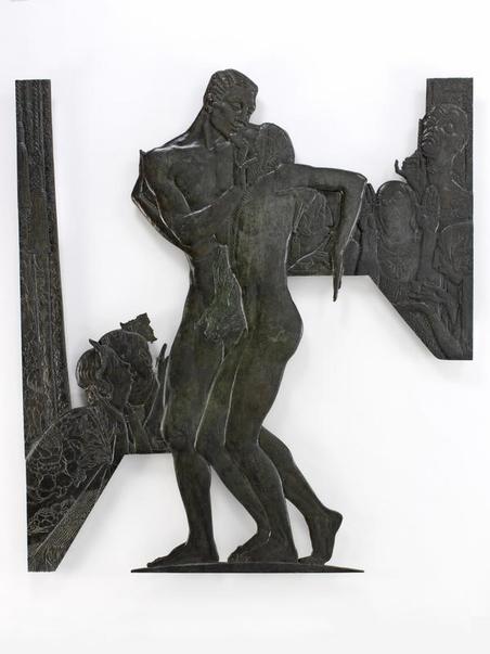
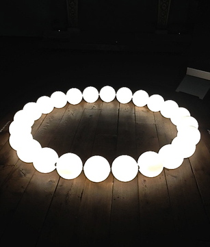
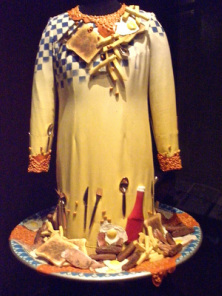
Places, Rachel Whiteread, Museum of Childhood
Recognising the importance of threshold, of transition space, may reflect a new and different approach to user focus in design, one that is looser, indeed less designed. The role of users in design has changed over the past 100 years, and now the imperative is to engage with users, not as individual consumers but as a collective, as part of the 'civic condition', and as co-designers. Design thinker Ezio Manzini suggests that connectivity is one of the keys to employing user-centredness in design. The importance of a user-centred approach, one that focuses on communities of 'users', lies in the sense-making role of design and the place of people in that sense-making. Co-design as defined by Manzini is like a multifaceted social conversation in which different actors participate in different ways and at different times. Co-designing with users ensures that the solution (the problem being solved) also has meaning – in fact, it is 'the only way of making sure that the technical solution found will actually be culturally and socially acceptable to the people and communities it is to benefit'. This too may sound uncontroversial, but its application of often more limited in practice, a sort of paying lip service to the needs of the user (consider customer satisfaction surveys as a means of bringing users' views into design and re-design).
 
Mae Architects explore how 'unexpected engagement' is designed into a space by allowing free movement between spaces and 'loose fitting', even advocating for some degree of non-design: 'Architecture which has enough presence to step back and not do the jazz-hands thing in public can be absorbed as part of a city.' Too much coherence locks you in; 'urbanistically being too specific can create monocultures'. Manzini sees connectivity as creating flexibility; it loosens and makes more fluid, in the way that temperature can affect the fluidity of materials.
 
Seams

This plasticity and flexibility and the encounters it can promulgate reflects too the intention of Shared Spaces, as in Exhibition Road just outside the V&A's new entrance. What Hans Monderman (the Dutch engineer who invented the concept of Shared Space) observed was that these safety elements of kerbs, crossings, traffic lights and railings prevent road users from interacting with each other; when lines are blurred between street and pavement, users are forced to look, engage and negotiate with one another, eye to eye. Monderman created more than 100 shared spaces in the Netherlands, and studies he carried out showed a reduction in accidents and no fatalities in Shared Spaces (Toth 2009). Monderman's designs are not seamless – on the contrary, the 'seam' of Shared Space is the ingrained caution hardwired into all of us when using the roads. But this caution is addressed in a fluid way using the age-old technique of eyeballing a fellow human.
 
One problem with user focus in design, noted by urbanist Richard Sennett, is that the trend for 'friction-free' design does away with resistance, with obstacles, with the limbo state of uncertainty. The idea is to design out the 'seams' so that they are invisible to the user. But this also designs out all sorts of serendipitous encounters. Instead, when you 'treat edges as seams', as Mae Architects suggest, thresholds become mediating devices for social exchange.
 
About the author:
 
Margaret Doyle is a Welcoming Ambassador at the V&A and author of the blog Good at Looking (www.goodatlooking.com). She is also a Visiting Research Fellow at the UK Administrative Justice Institute, University of Essex (www.ukaji.org).
 
Sources:
 
Mark Brown, 'V&A's 'less scary' entrance drives up visitor numbers' (The Guardian, 18 July 2018)
 
Mae Architects, Places for Strangers: Ideas for places, people and the city, by Mae Architects, edited by
Shumi Bose (Park Books, 2014)
 
​Ezio Manzini, Design, When Everybody Designs: An Introduction to Design for Social Innovation (MIT Press,
2015)
 
Kati Price, 'Designing a new welcome experience at the V&A' (V&A blog, 9 March 2018),
www.vam.ac.uk/blog/digital/designing-a-new-welcome-experience-at-the-va
 
Richard Sennett, Building and Dwelling (Allen Lane, 2018)
 
Gary Toth, 'Where the sidewalk doesn't end' (Project for Public Spaces, 16 August 2009),
https://www.pps.org/article/shared-space

1 Comment

Lost & found at the V&A…

9/2/2018

0 Comments

 
…a series inspired by my experiences as a volunteer Welcoming Ambassador at the Victoria & Albert Museum

Sex and intrigue at the Brompton Boilers

Picture
​“Probably no part of London can compete with South Kensington in the wide variety of interest which it offers to vastly different mentalities.”
 
                                                                                           H.V. Morton, In Search of London, 1951
 
Two years ago, one great thing about the David Bowie fever at the V&A was that it enticed people in who might not otherwise have considered visiting the museum. In spite of Morton's generous description of South Ken in 1951, the area isn't now often seen as one catering to 'different mentalities'. As Welcoming Ambassadors, my colleagues and I frequently were approached by visitors who had never been to the V&A, who had timed tickets to enter the Bowie exhibit in an hour, or in twenty minutes, and wanted to know what could they see in that time. It made for some fascinating ‘moments of shared happiness’ (as our mentor and colleague Glyn Christian calls them) and for some challenging moments as well, as we tried to identify which of the many collections in the Museum would spark the interest of a total stranger.
 
I had a couple ask me for advice on what to see for two people who had never met each other. They were young and sparky, and as I described the collections I saw their eyes light up on certain ones. (They settled on Architecture and the 20th Century Gallery.) You have to admit the Museum is an inspired choice of destination for a blind date.
 
I suspect many who don’t know the museum think of it as a stuffy Victorian institution, with objects encased in glass on dark shelves. This stuffiness is well illustrated in a passage from Thomas Crofton Croker’s A Walk from London to Fulham (1860), in which he described the collections of the V&A (then the newly opened South Kensington Museum) in a way that makes a visit seem more worthy than enjoyable:
 
“There are specimens here of ornamental art, an architectural, trade, and economical museum; a court of modern sculpture, and the gallery of British Art… the whole designed with the view of aiding general education, and of diffusing among all classes those principles of science and art which are calculated to advance the individual interests of the country, and to elevate the character of the people…”
 
Yet even back then there was something steamy about the locale. Around the time the Brompton Boilers were built (a nickname for the temporary buildings, used disparagingly by the leading architectural journal of the day, The Builder), Croker described the Brompton area as the locale for illicit activities:
 
“Brompton was formerly an airy outlet to which the citizen, with his spouse, were wont to resort for an afternoon of rustic enjoyment. It had also the reputation of being a locality favourable to intrigue.”
 
The possibilities for intrigue continue today. Of course, everyone’s taste is different, but one of my favourite pieces to inspire misbehavior is in the Sculpture galleries, in room 21: an Art Deco fireplace with a bronze relief by Charles Sargeant Jagger (1885-1934). The fireplace is considered one of the most important features in Mulberry House, in Smith Square, Westminster, designed by Edwin Lutyens. The house's renovation in 1930 was, according to the V&A's description, considered to be 'one of the finest achievements of a fruitful collaboration between interesting and enlightened patrons, an innovative architect and a painter and sculptor.'
 
The relief shows a naked couple part-embracing, part-fleeing a crowd of society ladies looking on in fascinated outrage. It was commissioned by Lord and Lady Melchett (Henry and Gwen Mond) as a reference to the untraditional relationship they enjoyed with the writer Gilbert Cannan.
Picture
Scandal, Charles Sargeant Jagger, 1930, @Victoria & Albert Museum, London
​Reviewing the renovated interiors in Country Life in 1931, Professor C.H. Reilly wrote:
 
'The bronze itself is a very delicate piece of modelling, and seems – if one must find a meaning for it – to represent “Scandal”. The central pair of nude figures – the lovers – while they make an interesting wall pattern, are a very expressive piece of modern sculpture, the angularity of which seems to heighten the emotion. The other figures in the background, making a rich texture with their clothes, are, one supposes, discussing and criticising the lovers – a very proper satire on the ordinary uses of the drawing room.'
 
The story behind this work is one of sexual openness and intrigue and is perhaps more steamy than the sculpture itself. Gwen Wilson, an artist from South Africa who had come to London to study at the Slade, and writer Gilbert Cannan were lovers who lived together in a studio in St John’s Wood. Gilbert had recently divorced from Mary Barrie, having been a co-respondent in the much-publicised divorce between Mary Barrie (a former actress) and J.M. Barrie (author of Peter Pan) in which mary claimed the marriage had not been consummated. Mary and gilbert's marriage itself didn't last long, apparently due to Gilbert's affair with the then 19-year-old Gwen.
 
The story goes that Henry Mond, wealthy heir to a finance business, had a motorbike accident outside the St John's Wood studio in 1918, and Gwen found him injured and helped nurse him to recovery. Mond moved in with Gwen and Gilbert and became their lodger, and eventually, lover (of Gwen) in an open ménage a trois. Two years later, while Gilbert was away on a lecture tour, promoting the work of his friend D.H. Lawrence, Henry and Gwen married. Gilbert, Henry and Gwen continued to live together after Gilbert's return. However, as curator Eric Turner reports, the Mond marriage precipitated Gilbert’s 'final, catastrophic and irreversible mental breakdown', and he was admitted to The Priory hospital in south London, where he remained from 1924 until his death in 1955.
Picture
Henry Mond, 2nd Lord Melchett by Glyn Philpot (1884-1937), 1932. Oil on canvas, 125.7 x 100.4 cm. Robilant & Voena, London and Milan
Picture
Gilbert Cannan in 1916. National Portrait Gallery, London
Picture
Gwen Mond, Lady Melchett by Glyn Philpot (1884-1937), 1935. Oil on canvas, 89.5 x 71.7 cm. National Gallery of Victoria, Melbourne
The Monds became a part of the social and political establishment, with a social circle that included a number of artists and, according to the V&A, 'skirted the fringes of the Bloomsbury circle, all of whom were in temperament or sexual mores, outsiders within the establishment'. The Monds' ambiguous relationship with society may have reflected the fact that Henry's family was Jewish and they were keenly 'aware of an undercurrent of anti-Semitism in English attitudes' and may have experienced some discrimination. Their unconventional living arrangements no doubt contributed to a sense of being outside society, although the fireplace they commissioned Jagger to design is more a celebration of the outrage they inspired. It was commissioned several years after Gilbert's breakdown and move to the Priory and pictures Gwen and Gilbert as the fleeing nudes.
 
Intrigue doesn't always turn out well. But no doubt it was all good fodder for the gossip columns of the time.
 
For more details and images of the Mulberry House Art Deco interior, see Eric Turner, 'Art Intimates Life: The Mond "Ménage à Trois"', Apollo Magazine, Sept 2009, http://theesotericcuriosa.blogspot.co.uk/2009/11/art-intimates-life-mond-menage-trois.html
 
0 Comments

Lost & found at the V&A…

23/9/2015

0 Comments

 
...a series inspired by my experiences as a volunteer Welcoming Ambassador at the Victoria & Albert Museum

Signs and Wonders

We recently re-launched the free 10-minute introductory talks offered at the Grand Entrance to the museum. During the madness of Savage Beauty, the wildly popular exhibit on the work of designer Alexander McQueen, we had to take down our sign offering these to make room for the crowds queuing for tickets to the sell-out show. Now that it’s calmer, we’ve started again, this time with a hand-held sign. Not everyone wants an introduction, but many new visitors seem to welcome a quick guide to the vast collections.

If I have the luxury on focusing their attention on one piece, I choose Signs and Wonders by Edmund de Waal. This is what I say:

Welcome to the V&A, the world’s greatest museum of art and design. A schoolroom for everyone – that’s the way its first director, Henry Cole, described it - a welcoming place to inspire and provoke. We are free, we are open every day, and we open late on Fridays.
Picture
Signs and Wonders, Edmund de Waal
Let me tell you a bit about the museum. First of all, I want you to look up, inside the dome in the grand entrance. Do you see the red shelf, with white pots on it, running along the inside of the dome? That’s an installation called ‘Signs and Wonders’, by ceramic artist Edmund de Waal. He produced this work to celebrate the revamping, several years ago, of the ceramics galleries on the 6th floor of this building, which is the later of the two buildings that make up the museum. (The early building is the dark red brick one on the other side of our garden, just through the shop. It was built to replace the Brompton Boilers, the glass and iron structure designed by Prince Albert after the Great Exhibition of 1851. It opened in 1857, and it was followed by this one we’re standing in, for which Queen Victoria laid the foundation stone in 1899, just two years before she died.)

De Waal describes the pieces in this work as “a kind of love story with the ceramics collections, and they’re a kind of conversation with the collections at the V&A, they’re a kind of a very personal memory of my journeys through the V&A’s ceramics collections over the last 30 years”. He chose this location because it’s the one place in the whole of the V&A that connects the ground floor, the threshold, with those great galleries.
Picture
Before this building was built, the first ceramics galleries were actually in the older building in what is now the Silver Galleries, on the 3rd floor. If you go up and see those galleries you can still see signs of their former occupants: a frieze high up painted with the names of centres of ceramic manufacturing from 100 to 1700 AD, two columns restored to their original glory, clad with Minton majolica reliefs, and what we call the Ceramic Staircase.

Picture
Picture
Picture
The V&A’s ceramics collection is unrivalled in the world and includes more than 34,000 objects from the 4th millennium BC to the present day. The collection is particularly rich in Ceramics from Asia, the Middle East and Europe. The Victorian founders of the V&A aimed to influence taste by collecting and displaying examples of the best designs, from ironwork to textiles, jewellery to pottery. Alongside British ceramics were gathered pieces from Europe, India, China, Japan, Turkey, Morocco and Iran. They range from a Coptic jar from 5th century Egypt to a vase by contemporary artist Grayson Perry.
Picture
For a hundred years, after moving to the 6th floor of this building up to the revamping of the galleries four years ago, the galleries were a half mile of dark mahogany cabinets and glass vitrines housing, as de Waal, has said, pot after pot after pot, pots layered on pots, ‘a collection of collections’. The V&A itself describes it as being cluttered, confusing and tired. It was, de Waal says, a melancholy place, and a virtually empty one, but he spent many happy hours there as a teenager finding his way through pots, making connections.

The new ceramics galleries opened in 2010. They attempt to tell significant stories of ceramic history, and unlike the previous arrangement of collections, they now juxtapose pieces from Asia and Europe, showing the influence of different cultures on one another. Gone are the dark cabinets, and instead we can see through the glass of one cabinet into another.

This fits in well with De Waal’s vision for his installation. He often works with what he calls ‘cargoes’ of pots, groups or multiples that make connections between cultures. Influenced by Japanese porcelain pottery, de Waal says he’s drawn to its naturalness and to its “contradictory notions of strength and fragility”. Each of the 425 pots is a shade of white, contrasting with the red lacquer steel shelf. The red colour is intentional, evoking the red seal in the corner of ink paintings.

pot after pot after pot, pots layered on pots, ‘a collection of collections’

De Waal describes his piece as “responding to the specific architecture of the place”. The shelf tracks the circumference of the dome, held in only four places – an astonishing and complex engineering feat that provides a link between past (the 1909 galleries as they were) and present (the new galleries), and between the ground (the Grand Entrance) and the unreachable heights of the dome.
Picture
I love what Glenn Adamson, formerly of the V&A and now director of New York’s Museum of Arts and Design, said about Signs and Wonders, that it has the ‘if’ factor: “If you look up it is there. If you don’t look up it is still there.” He also said that “The magic of the V&A’s vast permanent collection is that each visitor discovers it anew, through a unique and completely personal process of selection.”

One attraction for me is the way the ceramics galleries (although this holds true of many of the other galleries as well) blurs the line between art and craft – an often arbitrary and unnecessary distinction.

De Waal is one of many of Britain’s, and the world’s, most successful designers, artists and craftspeople who have used the V&A as a source of ideas and stimulation over the past 150 years: Arts and Crafts pioneers William Morris and William de Morgan (Islamic design), children’s author Beatrix Potter (textiles), Italian designer Alessi (Dresser), among others. Everyone is welcome to come here to see the work of these artists alongside the historic collections that helped to inspire them.

I hope you enjoyed this introductory talk!
0 Comments

Lost & found at the V&A...

24/1/2015

0 Comments

 
...a series inspired by my experiences as a volunteer Welcoming Ambassador at the Victoria & Albert Museum

David is back!

At the end of last year the V&A re-opened the Weston Cast Court, one of its famous two Cast Courts, after years of restoration and repainting. 

Among the treasures that have been under wraps are the much-loved plaster cast of Michelangelo’s statue of David. The original, in Florence, was created in 1501-04; the plaster cast was made in about 1867, when plaster reproductions were all the rage. 

Few Victorians could afford to do the Grand Tour of Europe and see the original works, and these plaster casts were studied by artists and the casually curious. They fell out of favour in the 20th century, and many collections were destroyed. At the V&A, the plaster casts were housed in the two purpose-built cast courts – 24-metre-high rooms, tall enough to house the cast of Trajan’s column, albeit in two sections. The 35-metre-high original in Rome has eroded, and the V&A’s copy allows researchers and other to study the carvings in detail. 

The casts have survived because these Cast Courts had no other purpose. They are now, as Polly Toynbee points out, “ safely passed the danger zone because they have turned old, rare and precious in themselves.”
Picture
“Opened in 1873, these high glass-roofed courts were built to house gigantic casts of Europe's greatest monuments, an array of the gothic, the classical and the renaissance, incongruously hugger-mugger. A huge Celtic cross, a Pisano pulpit, an intricately carved Norwegian doorway, knight crusader effigies from English churches, a lion from Brunswick, the gates of paradise from Florence, Byzantine mosaics from Ravenna, centuries and nations apart.” 
            Polly Toynbee, The Guardian, 13 November 2014    
Picture
PicturePhoto © V&A, Museum no: REPRO.1857A-161
When the cast of David was first revealed to Queen Victoria, she was so shocked (or so it's said; I suspect she was much hardier than the story suggests) that the museum had a plaster fig leaf made to cover his privates. It was hung on the statue from two strategically placed hooks. That fig leaf now takes pride of place in a special case behind the famous statue, as a reminder of our changing sensitivities.

The V&A says that in the early years of the museum, tin fig leaves were used on other nude statuary, but the authorities at South Kensington dismissed later objections, noting that "The antique casts gallery has been very much used by private lady teachers for the instruction of young girl students and none of them have ever complained even directly." 

The Cast Courts can be enjoyed for free at the Victoria and Albert Museum.
0 Comments

Lost & found at the V&A…

14/9/2014

1 Comment

 
...a series inspired by my experience as a Welcoming Ambassador at the Victoria & Albert Museum

Lost at sea

Picture
This time of year is London Design Festival time at the V&A, when visitors to the museum can enjoy a number of innovative temporary installations by contemporary designers. The 9-day festival celebrates design London-wide, with more than 300 events across the city, but the V&A is the heart and hub.

One of my favourite installations is Ama, a blown-glass work inspired by, and paying homage to, the pearl-diving women of Japan. The piece, the work of Cyrpiot-born and London-based designer Michael Anastassiades in collaboration with Italian design house Flos, is made up of mouth-blown opaline spheres and brass. Laid out as a larger-than-life pearl necklace, resting in the dark on the floor of room 118 of the British Gallery, it glows and draws you in.

Picture
Ama 2014. Michael Anastassiades and Flos. Gallery 118, British Galleries, Level 4, V&A Museum
Picture
The Ama are deep-sea divers, all women, harvesting pearls, seaweed, and other treasures from the floor of the ocean. These ‘pearl diving mermaids’ were first mentioned in a Japanese poem in the oldest anthology of Japanese poetry, the Man’yoshu, in about 750.

The V&A gives an evocative description:

“The simple, even primitive beauty of these women who harvested seaweed, turban shells and abalone from beneath the coastal waters can be tracked 2000 years back in history, as recorded in the oldest Japanese anthology of poetry. Only equipped with visual acuity, lung capacity and a hunter’s instinct, Ama women would dive some 30 feet down in cold water, confronting minus zero conditions at times and only wearing a loincloth, in search of the goods lying on the ocean bed.”

I got a bit lost myself when, after seeing this beautifully mysterious installation, I did a bit of research on the Ama. Why had I never heard of them before? I discovered a blog post about the Ama, with photographs, that tells more about this community. They continue today as an example of sustainable fishing and a model of women earning an independent living. They dive up to 25 metres, for 4 hours a day, without oxygen tanks. When they surface they make a soft whistling sound, known as ‘Isobue’, to expel the breath they’ve been holding for up to 2 minutes at a time. Most are older women who have carried out this work for many years; according to the Gakuran blog, one woman continues to dive well into her 90s.

I also found an article with this description of the life of the Ama women during diving season, which:

“revolves around the ama hut, or amagoya. This is the place where the divers gather in the mornings to prepare for the day, eating, chatting and checking their equipment. After diving they return to the hut to shower, rest and warm their bodies to recover from their day’s work. The atmosphere in the hut is one of relaxation and camaraderie, for six months of the year the women are free from the usual familial and social duties they are expected to perform, and they are able to connect with other women who share their love of the ocean and diving. In the past, when career opportunities for women in a small village were limited and married women were expected to stay at home under the watchful eye of their mother in law, life as an ama must have been an attractive prospect despite the tough conditions and potential dangers.”

But the culture appears to be fading out, and the work no longer presents the unique opportunity it once did for women to earn a lucrative independent income. Partly that’s down to changes in the ocean environment; although the Ama introduced rules, including limits to diving time, to protect the ocean’s ecosystem and avoid over-fishing, pollution has reduced the growth of abalone. And as women’s career prospects have improved in the past 60 or so years, the draw of pearl diving has declined.

“Many of the divers active today are in their 50s and 60s, with very few ama aged in their 20s and 30s. The work of the ama seems to be a unique opportunity for Japanese women to engage in competitive, exciting, potentially lucrative work that provides a great amount of freedom and independence but at the same time allows women to be part of a tight-knit group of fellow enthusiasts that life as a housewife would not have afforded. In previous generations this was very rare and would explain why the job was attractive despite the harsh conditions and potential danger.”

The Ama fascinate both in their mythical image as modern-day mermaids and the pragmatic feminism of economic independence. It’s interesting that at the V&A we just had a very successful exhibit on pearls, but I don’t remember the ’pearl-diving mermaids’ featuring largely in that. Anastassiades has created a moving tribute – hopefully one that will prompt visitors to learn more about these divers and their culture. 


1 Comment

Lost & found at the V&A…

26/4/2014

0 Comments

 
…a series inspired by my experiences as a volunteer Welcoming Ambassador at the Victoria & Albert Museum

Three toast racks in four centuries

“To make dry toast properly, a great deal of attention is required, much more, indeed, than people generally suppose.”

Mrs Beeton, Household Management, 1861

The toast rack appears to be a purely British invention from the late 18th century. They were sometimes referred to as ‘toast machines’, and Mrs Beeton (the 19th-century household management guru) wrote about the importance of toast racks in her well-known book Household Management in 1861, advising that “As soon as each piece is ready, it should be put into a rack, or stood upon its edges, and sent quickly to table.”

As useful objects, toast racks have somewhat fallen out of favour recently. As examples of design, however, they are timeless. I’ve taken three examples, each of which serves as a reflection of the significant design innovations/movements of their time...and a fourth that demonstrates the timelessness of good design.

1) The 18th Century - Hester Bateman toast rack

The first piece in our ‘Toast Rack Tour’ is in the Silver Galleries, room 65. It was produced in the workshop of Hester Bateman, a successful silversmith in the late 18th century. She learned her trade from her husband, and she set up her own business when he died in 1760. The V&A says that it’s likely that she managed the workshop rather than made the silver pieces herself. Her firm was one of the most technologically advanced silver firms in London at the time, exporting across England and North America.

Picture
Hester Bateman Toast Rack 1787-88. M.125-1940, Room 65, case 19, shelf 15. Photo: M. Doyle.
This silver toast rack, from Bateman's workshop in 1787-88, is elegant and modern, with its oval shape and clean lines. The rack of wirework and the base were cut from sheet. The components were machine made but assembled by hand as a result of new production techniques developed in Sheffield.

Technological developments from the 1760s led to manufacturing innovations that are demonstrated in a number of toast racks from the period. Sheffield plate, for example, was a laminate of sterling silver fused onto a copper core. It was cheaper to use than silver and meant items could be produced for less wealthy customers using designs originally made in more expensive silver. Some toast racks of this period were made almost entirely of sections of wire soldered together.

2) The 19th Century – Christopher Dresser toast rack

The second piece in our tour of toast racks is in the British Galleries, room 125, on level 4.

Freelance designer Christopher Dresser is, in my book, the King of Toast Racks. His toast racks are among his most innovative and recognisable designs – simple lines, striking profiles, form and function brought together in an apparently effortless way.
Dresser - botanist, writer, scholar, designer - was working in the late 19th century, and his ethos contrasted with that of his contemporary William Morris. Morris and his Arts and Crafts movement deplored the way industry and mass production were breaking the link between maker and user. They wanted a return to the integrity and honesty of hand crafting. Dresser, on the other hand, celebrated the opportunities offered by mass production and the way it could bring beautiful design to a wide audience.

This Dresser toast rack, made in 1880, is of electroplated nickel silver. It was mass produced and anticipates the Modernist style of the following century.

Picture
Christopher Dresser Toast Rack 1880. M.14-2005. Room 125e, case 1. Photo: © V&A Images.
3) The 20th Century – Robert Welch toast rack

The third item in the tour is in the 20th Century Gallery on level 3.

Mid-century designer Robert Welch carried on the tradition of Arts and Crafts designers but like Dresser he embraced mass production. His Campden Range from 1957 demonstrated an early use of stainless steel for dining tableware. The rocket-like shapes of his candelabra and cruet set reflect the interest in the emerging Space Age.
Picture
Robert Welch Campden Toast Rack 1958. Photo: Old Hall Club http://www.oldhallclub.co.uk
Welch was appointed as design consultant to J.J. Wiggin of Bloxwich, a family business established in 1893 that began manufacturing stainless steel tableware in 1928. The story goes that the current owner's grandmother suggested stainless steel as low-maintenance alternative to silver. The company was also known as Old Hall and it produced many notable designs in stainless steel in the mid-20th century.

This toast rack was made in 1958 and is of stainless steel. It won Welch the Council of Industrial Design Award in 1958. The judges praised its ‘economical design’, its ‘elegant and ingenious construction’ and the ‘eminently suitable material’ of stainless steel.

2) (again) The 21st Century – Alessi toast rack

And finally, we come to the last toast rack in our tour, which unfortunately is not on display in the V&A. It’s not a fourth example but a revisit of the second one - a stainless steel modern replica of the Dresser toast rack shown above, still being produced by the Italian company Alessi.


Perhaps toast racks haven't fallen completely out of fashion then. Thank goodness for that. Mrs Beeton would be pleased that standards of toast making are being maintained to this day.
Picture
Alessi Toast Rack 2005. M.14-2005. Photo: © V&A Images.
0 Comments

Lost & found at the V&A....

17/3/2014

0 Comments

 
…a series inspired by my experiences as a volunteer Welcoming Ambassador at the Victoria & Albert Museum

Madam, breakfast is served

The restaurant at the V&A was originally a place for evening meals – for Victorian folk to get a reasonably priced bite to eat after work before wandering the collection to be educated in, and inspired by, what was good taste and what was bad. 

For me, breakfast, not dinner, is the most inspiring meal of the day. These days, you can get a very decent breakfast in the Museum’s restaurant. And afterwards, you can wander the collection and marvel at objects inspired by the most inspirational meal of the day.
Picture
Breakfast table. W.64:1 to 3-1950. © V&A Images.
Start in the British Galleries, 4th floor, in a side gallery (room 118a), with a table from the mid-eighteenth century. Not just any table, but a mahogany breakfast table designed by Thomas Chippendale, furniture designer extraordinaire, and made by an unknown maker somewhere around 1760.

Apparently, Henry VIII had a walnut breakfast table in his Privy Chamber. In the 1700s, the rich and fashionable continued to have breakfast in their bedrooms, and tables were adapted to include storage for writing and reading, for those with multi-tasking skills. 
Eggs are, of course, a staple of the Anglo-Saxon breakfast (although in the past both broth and sardines were popular, and our Continental neighbours in Germany and the Netherlands prefer hams and cheeses). The rich would have had cups for boiled eggs made of silver, but the designs were for everyone and were made in less expensive materials for the less wealthy. 

This egg cup stand, also in room 118a, is from about 1790 and was made in moulded creamware, in a design probably originally made in Sheffield plate.    
Picture
Egg cup stand. C.5 to F-1945. © V&A Images.
The Museum’s description notes that although the egg stand is elegant, a “minor drawback was the fact that the eggcup feet (which provided stability) had to be smaller than the bowls in order to lodge in the holes of the stand.” A bit of a fashion victim, then, but also a survivor. The creamware examples were vulnerable to breakage, so it is rare to have one intact as this one is.

You would need a toast rack to serve the toast. While in this part of the British Galleries, have a look at the toast rack in the Woolfson Gallery, room 118 – a stunning example of toast rack design in an unusual shape of a lyre. 

This one is from 1790, not long after the toast rack first appeared on English breakfast tables, and is made of Sheffield plate (copper-plated silver).
Picture
Toast rack. M.122-1937. © V&A Images.
Picture
Dressing gown. T.395-1980. © V&A Images.

Now consider what to wear to breakfast, and head to room 125b, case 3. 

This dressing gown from the mid-nineteenth century would have been the perfect outfit – casual but beautiful and very warm (for those draughty houses). It’s made of jacquard woven silk, quilted and silk-lined, in a style of a frock coat.

Often, men wore these over their nightshirts if they had just jumped out of bed, but some put on their trousers and shirt first, then the dressing gown.

Breakfast attire can be even more outrageous, as in this dress of Dame Edna Everidge’s that pays homage to the Full English. You can see it in the Theatre and Performing Arts Gallery, a mini-museum within the V&A. 

Complete with sausages, bacon, eggs and baked beans, the dress celebrates breakfast with the irreverent fervor this most humorous of meals deserves. Dame Edna (Barry Humphries’ ‘housewife superstar’ creation) said she felt like ‘a transport caff on legs’ wearing this.

Picture
Breakfast dress for Dame Edna Everidge, designed by Stephen Adnitt, 1996 © Margaret Doyle 2014.
Who knew that breakfast at the V&A could serve up such a sumptuous smorgasbord of delights?
0 Comments

    About me

    I'm Margaret Doyle, a mediator and researcher in administrative justice. I'm also a Welcoming Ambassador at the Victoria & Albert Museum, the world's leading museum of art and design.

    Categories

    All
    Alessi
    Althea McNish
    Anna Maria Garthwaite
    Architecture
    Barbara Jones
    Bermondsey
    Blue
    Breakfast
    British Library
    Cemeteries
    Charles Sargeant Jagger
    Christopher Dresser
    Colour
    Cornelia Parker
    Craft
    Democracy
    Edmund De Waal
    Embroidery
    Enid Marx
    Etal Adnan
    Folk Art
    How To Look
    Kaffe Fassett
    Kurt Schwitters
    Mae Architects
    Magna Carta
    Marie Gudme Leth
    #metoo
    Mona Caron
    Pat Taylor
    Phyllis Barron And Dorothy Larcher
    Plants
    Popular Art
    Public Art
    Rachel Whiteread
    Rule Of Thirds
    San Francisco
    Shared Spaces
    Tapestry
    Tate Britain
    Textile Design
    Tracey Emin
    UK Parliament
    Utility Covers
    V&A Museum
    Walking
    White Cube

    RSS Feed

    Archives

    May 2019
    January 2019
    August 2018
    February 2018
    December 2017
    September 2015
    May 2015
    March 2015
    January 2015
    December 2014
    November 2014
    September 2014
    July 2014
    June 2014
    April 2014
    March 2014
    January 2014
    September 2013
    August 2013
    July 2013
    June 2013
    May 2013
    April 2013

Powered by Create your own unique website with customizable templates.