Good at Looking
  • Good at Looking blog
  • About Good at Looking
  • Contact Good at Looking

Deadly inspiration

28/4/2013

0 Comments

 
“This is the dark side of a beautiful picture.”

I saw this quotation on a gravestone in my local cemetery. Is it a grim thought? A poetic one? Or merely a realistic one? I couldn’t decide. But I do know I love cemeteries and I seek them out whenever I’m walking. 

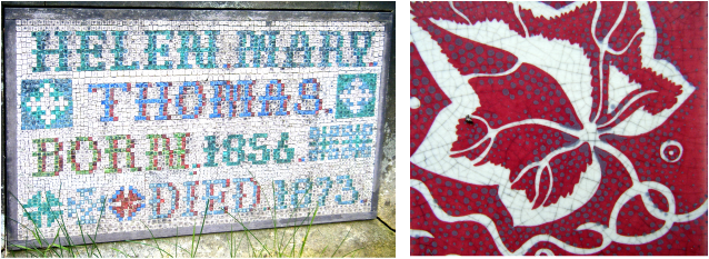
In Brompton Cemetery I've found surprising splashes of colour. 
Picture
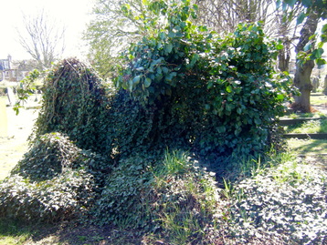
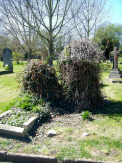
Brompton Cemetery is one of London’s oldest and most atmospheric - one of the Magnificent Seven private cemeteries established in the mid-nineteenth century in a ring around the city to provide more space for the dead. (Other Magnificents include the more famous Highgate Cemetery in north London).

Brompton was opened in 1840 and was a fashionable place for the Victorian middle class to show off their wealth and obtain immortality in style. More recently it's been in several films, including The Wings of the Dove, GoldenEye and Stormbreaker. Famous residents include suffragist Emmeline Pankhurst and Henry Cole, founder of the V&A Museum.

In Fulham Old Cemetery, which opened in 1865, I found graves that had been left to the forces of nature, looking like ivy monsters.

Picture
Picture
Picture
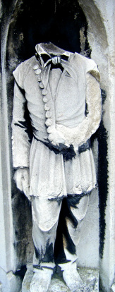
In the graveyard at Chiswick Parish Church (St Nicholas), which my friend Carey and I visited during one of our 'talk and walk' sessions along the Thames, we saw the tomb of William Hogarth, the painter and engraver who lived nearby and was buried here in 1764.
Picture
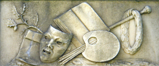
Even without famous inhabitants, cemeteries are inspiring places, especially for design - have a look at these gravestone details on the right.
0 Comments

Slow down

26/4/2013

0 Comments

 
Tomorrow, 27 April, is Slow Art Day. The point is to look at five works of art for ten minutes each, then meet with others to discuss the works. The goal? To encourage the art of seeing. Kind of fits with Good at Looking, doesn't it?
Picture
L.S. Lowry, Hillside in Wales (1962), on display in 'Looking at the View' at Tate Britain until 2 June 2013
Apparently the average viewer spends just 17 seconds looking at each painting or sculpture when wandering through a museum. In his book How to Look at a Painting, Justin Paton (who rightly questions if there is an 'average viewer') suggests there are two types of art lookers - the  Suddenlys, who want an epiphany that hits like a freight train, and the Slowlys, who think art deserves patience. Paton thinks it can take an hour in front of a single work for the the 'stray associations' in the brain (the parking meter, the piped-in muzak, the grocery list) to settle down and allow the picture to disclose itself.

He also recommends taking good company to get the most of that hour. What better way to spend tomorrow than to go spend some quality time with a friend and an artwork?

Slow Art Day is an international event that was started in 2008 and so far most of the venues are in the States, but there are more than 250 museums and galleries participating, including Tate Britain, Whitechapel Gallery and the Photographers' Gallery here in London.
0 Comments

Colour shock

21/4/2013

0 Comments

 
Picture
Kaffe Fassett: A Life in Colour - 50 Years of Textile Art, Fashion and Textile Museum, 2013
“We told each other which colors we liked best together, and I remember the feeling of profound originality I experienced when I insisted, although it had just occurred to me, that I had always liked black and brown together best. I saw them floating in little patches of velvet, like the crazy quilt, or smooth little rectangles of enamel, like the paint-sample cards I was always begging for at the general store.”

Elizabeth Bishop, Exchanging Hats (Carcanet 1997)

Where do you stand on this issue of colour? I wondered about this as I went through the small but vibrant exhibit of work by knitting guru and textile designer Kaffe Fassett at the Fashion and Textile Museum in Bermondsey. I’m someone who believes black is the loveliest colour there is, and like Elizabeth Bishop I like black with brown – earthy colours. This show was way out of my league colourwise. 
Picture
Kaffe Fassett: A Life in Colour - 50 Years of Textile Art, Fashion and Textile Museum, 2013
Fassett considers colour to be 'a vital ingredient in life', and he was greatly influenced by a trip to India twenty years ago. Travel seems to be a key source of creative use of colour for him; a video showing in the museum's shop on my visit showed him ecstatic to discover a stall of hardware at a market in Vietnam, with screws and nails set out in small wooden boxes, making an impromptu patchwork quilt of bronzes, golds, silvers and greys.

Colour is vital and has great significance – historically, culturally, politically. Just think of the fuss made this week about what colour tie various newsreaders would wear when reporting on Margaret Thatcher’s funeral. We know that in different cultures colours mean different things. In Britain, for example, white only became associated with wedding dresses in the mid-nineteenth century, during Queen Victoria’s reign, after she was married in a white dress. Marrying in white meant you had money; otherwise you got married in whatever your best clothes were. In the US, red means Republican; in Britain it means Labour; in India it’s the colour of weddings. For anyone interested to learn about colours, have a look at Pantone: A Color History of the 20th Century; Brain Pickings has a lively review of this ‘fascinating and uncommon lens on familiar cultural history’ on its site at www.brainpickings.org/index.php/2011/11/23/pantone-book/.

‘Extravagant’ is one term used by the Fashion and Textile Museum to describe the range of colour and texture Kaffe Fassett uses in shawls, sweaters, cushions and quilts. That’s an ambiguous term, suggesting lushness but without purpose. For some, Fassett’s work lies on the decorative crafts end of the art spectrum, with all the twee connotations of knitting and interior design. For others, his pushing at the boundaries of traditional arts, including knitting but also quilting and embroidery, is inspirational - and all the more so for being a man in a traditionally woman's world. 

Whether you like his work or not, there’s something unnerving about so much bright colour in one place. It’s a sort of assault on the senses, but in my view that’s not a bad thing. Sometimes we need to be assaulted – shaken and stirred.

Kaffe Fassett: A Life in Colour is on at the Fashion and Textile Museum until 29 June 2013.
0 Comments

Walking the block

15/4/2013

0 Comments

 
I bought the most amazing book the other day, from Pallant House Gallery in Chichester. It's called Walking the Block, and it's a wonderful book of poems by Ruth Weir, who was inspired by two women artists who ran a textile printing business in the 1930s – Phyllis Barron and Dorothy Larcher. They did hand block printing, making their own vegetable dyes and blocks. Weir’s poems don't narrate their life stories but instead pick up on events and inspiration in their lives. The book sets the poems amongst colour pictures of the textiles Barron and Larcher designed. It is a richly rewarding book to spend time with - to read, and to revisit. Its very existence is evidence that e-books will never make real books unnecessary.

But this isn't a rant about e-publishing. It also isn't a review of the book. But it does nick the book's title - which comes from what you do when block-printing fabric - you lay the fabric (or 'stuff') on a large table and walk the printing block along the length of fabric as you print. I love that image. And I love walking. And the title reminded me of the famous line of painter Paul Klee's - he supposedly said that drawing is just taking a line for a walk.

Walking is a great way to practise active seeing. Walking along my local streets recently, I noticed the shapes of the access covers (formerly known as manhole covers, but in desperate need of a more poetic and gender-neutral name). They are graphic gems, with beautiful geometric designs.
What they remind me of are the textile designs of Enid Marx. At one point in the 1920s she worked with Larcher and Barron, then started her own workshop. She was commissioned by the London Passenger Transport Board to design the fabric used for the seats on buses and tubes – called moquette, it is a durable velvety fabric that can withstand abuse. In its obituary of her in 1998, The Independent quoted her describing the strict brief she had to work to:

“The seating needed to look fresh at all times, even after bricklayers had sat on it, so there was a camouflage problem. The design, therefore, had to be bold but, because it was for a moving vehicle, should not be dazzling to passengers. In order to achieve the right effect strong contrasting tones had to be used, combined with changes of texture, from cut to uncut moquette. The scale of the repeat was governed by the economy of cutting up upholstery for seats of divergent sizes.”

Marx later became a member of the Board of Trade Utility furniture, and was in charge of textile design for this post-war initiative to produce inexpensive furniture to replace that lost in bombings. 

You can see Marx’s moquette designs at www.colourfulbeautifulthings.co.uk/colour-pattern-joy-2/

Chevron, Double Diamond and Shield are all designs that she produced that are still available. You can see these on the London Transport Museum website.

Compton Verney House in Warwickshire has an exhibit of Marx's work, on until 15 December 2013.
0 Comments

How do you look?

5/4/2013

0 Comments

 
"Forever we will search and give our thought to the picture we have in our mind.
We are walking around now as sad as can be.
The nature of our looking.”

Gilbert and George, The Nature of Our Looking, 1970

I started this blog after being in a painting workshop run by my friend and colleague Elaine, a brilliant watercolour painter and also a speech and language therapist and fellow mediator. She taught us that painting is about two-thirds looking, and one-third doing. Look, really look…and try not to paint what your brain thinks it sees. A chair is a chair, right? Your brain tells you it has four (or maybe three) legs, a seat, maybe a back and arms. But forget all that and just look at the damn thing, and draw what your eyes see, not what your brain sees. Be a good looker and you will learn to paint.

She didn’t actually say all that – I’ve elaborated and embellished, and I hope she’ll forgive me. But what she said resonates with me in so many ways. As a mediator – my vocation for 25 years – I’ve been trained in active listening, hearing people’s stories attentively, indicating without words that I’m paying attention. Interestingly, active listening is about taking in information un-mediated by our own assumptions, beliefs, stereotypes. It’s exhausting but energising at the same time. I think active looking feels the same way. And it takes some practice.

To mix my metaphors, it’s a bit like what’s said about muscles, and brains – use ‘em or lose ‘em. Your creative bone needs to be stimulated, nudged, maybe even poked and prodded. That sometimes feels like too much hard work. I hope this blog will make it easier.

First step - consider the nature of your looking. Don't ask someone else, How do I look? Ask yourself.

0 Comments

    About me

    I'm Margaret Doyle, a mediator and researcher in administrative justice. I'm also a Welcoming Ambassador at the Victoria & Albert Museum, the world's leading museum of art and design.

    Categories

    All
    Alessi
    Althea McNish
    Anna Maria Garthwaite
    Architecture
    Barbara Jones
    Bermondsey
    Blue
    Breakfast
    British Library
    Cemeteries
    Charles Sargeant Jagger
    Christopher Dresser
    Colour
    Cornelia Parker
    Craft
    Democracy
    Edmund De Waal
    Embroidery
    Enid Marx
    Etal Adnan
    Folk Art
    How To Look
    Kaffe Fassett
    Kurt Schwitters
    Mae Architects
    Magna Carta
    Marie Gudme Leth
    #metoo
    Mona Caron
    Pat Taylor
    Phyllis Barron And Dorothy Larcher
    Plants
    Popular Art
    Public Art
    Rachel Whiteread
    Rule Of Thirds
    San Francisco
    Shared Spaces
    Tapestry
    Tate Britain
    Textile Design
    Tracey Emin
    UK Parliament
    Utility Covers
    V&A Museum
    Walking
    White Cube

    RSS Feed

    Archives

    May 2019
    January 2019
    August 2018
    February 2018
    December 2017
    September 2015
    May 2015
    March 2015
    January 2015
    December 2014
    November 2014
    September 2014
    July 2014
    June 2014
    April 2014
    March 2014
    January 2014
    September 2013
    August 2013
    July 2013
    June 2013
    May 2013
    April 2013

Powered by Create your own unique website with customizable templates.