Good at Looking
  • Good at Looking blog
  • About Good at Looking
  • Contact Good at Looking

Lost & found at the V&A....

12/1/2014

0 Comments

 
....a series inspired by my experiences as a volunteer Welcoming Ambassador at the Victoria & Albert Museum

[Wo]Mankind

“One day she abruptly asked me, 'Do you like the nude, Elizabeth?' I said yes I did on the whole. Marianne: 'Well, so do I, Elizabeth, but in moderation'... ."
                                                                                              
Elizabeth Bishop, Exchanging Hats, Carcanet (1997)
Picture
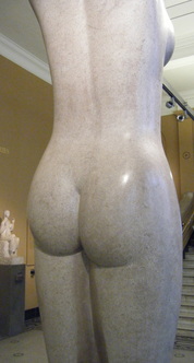
Mankind by Eric Gill, 1928 (Victoria & Albert Museum)
I often wonder if visitors are shocked to be greeted by a large and luscious bare behind when they come to the V&A. When you enter the museum from the Exhibition Road entrance or the tunnel from South Kensington tube station, you’re immediately met with Eric Gill's larger-than-life sculpture of a nude woman. Carved from a single piece of Hoptonwood stone, it's a modern-day Venus de Milo and is smooth and round and very tempting to touch. 

Gill, who started out as a stone mason and letter cutter, features in our day-to-day lives more than many visitors might realise, but not for works like Mankind. Many of his works commissioned by public bodies (including for the BBC's Broadcasting House and the headquarters of London Transport) are well-known landmarks around London. He designed a number of typefaces in the mid-1920s, including Perpetua and Gill Sans, that are still widely used today. 

Mankind has been referred to as the ‘personification of womanhood’. I’m not sure about ‘personification’, but it certainly is an image of womanhood, making it all the more baffling why it's called Mankind. For me, though, it treads a fine line between personification and objectification, and I still can't decide which side of that line I think it falls on.
0 Comments

Leth is more - Danish textile design pioneer

4/1/2014

0 Comments

 
Picture
On a recent visit to Copenhagen’s Museum of Design and Art, I came across this unrelentingly cheerful textile by Marie Gudme Leth (1895-1997). The textile is striking in itself, but I was amazed to learn what a significant impact Leth herself had on Danish design.

Leth transformed Danish textile production by introducing screen-printing through her Danish Calico Printing Works, a studio she set up in 1935. Before that she had travelled in Indonesia in her 20s and learned batik techniques, then experimented with block printing and set up a workshop producing block-printed textiles.

In 20th Century Pattern Design, Lesley Jackson writes that Denmark had no tradition of printed textiles until Leth established her screen-printing studio. Leth turned to screen-printing (which she learned in Germany) after finding block-printing to be too limiting in terms of production.

Her early work has many parallels with that of Phyllis Barron and Dorothy Larcher, two English textile designers who also set up their own studio in the 1920s. Barron and Larcher used labour-intensive hand-made production techniques for their block-printed textiles, including making their own natural vegetable dyes. Like Leth, Barron and Larcher used a limited colour palette and raw or unbleached linen for their block-printed textiles.

There the similarities seem to end, because Leth was interested in techniques that would allow for industrial production of printed textiles – hence her shift to screen-printing. Barron and Larcher continued with their hand methods until they closed their studio in 1939. (Interestingly, one of their apprentices in the 1920s had been Enid Marx, who went on to design for London Underground and the Utility Scheme, working closely with manufacturers on industrial production of her designs. I wrote about Marx in an earlier blog post – Walking the Block).
Learning about Leth has given me the opportunity to return to the theme of botanicals in textiles that I touched on when I wrote about Anna Maria Garthwaite. Many of Leth’s designs feature plants, both familiar ones like this cherry print (right) and more exotic types perhaps influenced by her time in Indonesia. They are highly stylised instead of naturalistic, and they have a folky feel rather than fussy. Jackson points out that even her screen-printed designs resembled block prints, with repeats of motifs set against a solid background – in keeping with Leth’s assertion that a printed fabric should not be a painting.
Picture
Kirsebaer (Cherries), Marie Gudme Leth, 1946
0 Comments

    About me

    I'm Margaret Doyle, a mediator and researcher in administrative justice. I'm also a Welcoming Ambassador at the Victoria & Albert Museum, the world's leading museum of art and design.

    Categories

    All
    Alessi
    Althea McNish
    Anna Maria Garthwaite
    Architecture
    Barbara Jones
    Bermondsey
    Blue
    Breakfast
    British Library
    Cemeteries
    Charles Sargeant Jagger
    Christopher Dresser
    Colour
    Cornelia Parker
    Craft
    Democracy
    Edmund De Waal
    Embroidery
    Enid Marx
    Etal Adnan
    Folk Art
    How To Look
    Kaffe Fassett
    Kurt Schwitters
    Mae Architects
    Magna Carta
    Marie Gudme Leth
    #metoo
    Mona Caron
    Pat Taylor
    Phyllis Barron And Dorothy Larcher
    Plants
    Popular Art
    Public Art
    Rachel Whiteread
    Rule Of Thirds
    San Francisco
    Shared Spaces
    Tapestry
    Tate Britain
    Textile Design
    Tracey Emin
    UK Parliament
    Utility Covers
    V&A Museum
    Walking
    White Cube

    RSS Feed

    Archives

    May 2019
    January 2019
    August 2018
    February 2018
    December 2017
    September 2015
    May 2015
    March 2015
    January 2015
    December 2014
    November 2014
    September 2014
    July 2014
    June 2014
    April 2014
    March 2014
    January 2014
    September 2013
    August 2013
    July 2013
    June 2013
    May 2013
    April 2013

Powered by Create your own unique website with customizable templates.