Bowie fever is over. For now, at least, and here – David Bowie Is has started its world tour and is moving on to Toronto. It was a sell-out show, and every day people queued up outside the museum to try to get tickets. It was an amazing experience, with a high-tech sound system that moved with you throughout the exhibit, with excerpts of interviews and, of course, music.
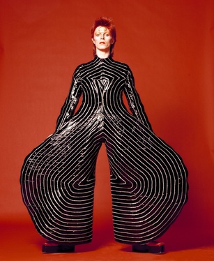
Striped bodysuit for Aladdin Sane tour 1973. Design by Kansai Yamamoto. Photograph by Masayoshi Sukita. The David Bowie Archive 2012.
For some reason Bowie hadn’t really registered with me in my youth. Maybe it was the time - he was experimenting with music, style and personas in the 1970s, when I was still a preteen. Maybe it was the fact that I grew up in the USA, and he was definitely a Brit-grown artist. But neither of those seems adequate excuse for my lack of appreciation of him and his work. What resonates with me now – in middle age, with relatively tame musical tastes – are his energy for mining a vast range of art and talent to seek out inspiration and the creative focus he applied to doing so. There is an intellectual joy that comes across in this exploration of his work. He found inspiration in theatre, literature, visual art, performing art, fashion. He was also a painter – something maybe many of his fans don’t know. The portrait of Japanese writer Yukio Mishima (who committed suicide, or seppuku, in 1970) that Bowie painted during his years in Berlin is particularly beautiful and haunting.
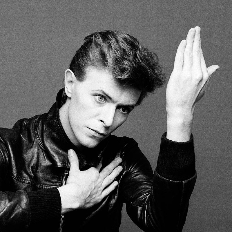 Heroes album cover shoot, 1977, photograph by Masayoshi Sukita. © Sukita, courtesy the David Bowie Archive. | Bowie was a role model for all the geeky outsiders in school who wondered how to be true to themselves and survive. He played with his image, wearing his hair very short at a time when that was loaded with significance, and dyeing it bright orange. He wore outrageous costumes – like the jumpsuit he wore to perform ‘Starman’ on Top of the Pops in 1973. He described this costume as an ‘ultra-violence in Liberty fabrics’ – ultra-violence being one of the pursuits of the main character in Clockwork Orange, a book Bowie greatly admired. Writer JG Ballard described Bowie as ‘an astronaut of inner space’. He was fascinated with Orwell’s 1984 and sceptical that our obsession with technology would bring about progress. |
There is a certain irony in learning that Bowie was born just after the establishment of the welfare state in Britain – 1947. The day before I saw the exhibit was a sad day for Britain – a complete rolling back of the social welfare state and a one-sided renegotiation of the social contract, brought about by drastic and nasty cuts to welfare benefits, privatisation of the NHS and withdrawal of most legal aid. How much of Bowie’s creativity was nurtured by the safety net that existed while he developed? Perhaps not a lot – he was, after all, earning a fortune by his mid-20s. But in a single generation we have gone from supporting young people to go to university (yes, in a more elitist way than now), ensuring everyone has health care even if they’re not working, and providing a social housing net that worked for many years and kept London vibrant and diverse – to a position where young people have no idea if they will be able to get jobs, whether or not they’ve gone to university, have very few housing options (especially in London), and who in their lifetime might see the disintegration of a much-admired system of universal health care. We see fear of protest (in light of the draconian sentences dealt out to some rioters and student demonstrators last year) and long-term squatters being evicted.
Rebel rebel, your face is a mess. It makes me wonder where the future Bowies will come from.
See a trailer for the film of the David Bowie Is exhibit.
Rebel rebel, your face is a mess. It makes me wonder where the future Bowies will come from.
See a trailer for the film of the David Bowie Is exhibit.


 RSS Feed
